
Brian
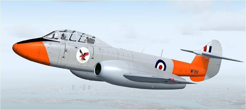
Gloster Meteor T.7
Moderators: Guru's, The Ministry, The Painters
Re: Gloster Meteor T.7
Beautiful! 
Brian
Brian
-
Ben Hartmann
Re: Gloster Meteor T.7
Touche, Garry, Touche.Garry Russell wrote:We are establishing they are silver whIch is not at all like bare metal so will look more grey
Bit by bit with constructive comments is the way forward,trying to avoid the horrors of photo(un)real along the way
Looking alot less flat now Jason
Have a mess aorund and see what you think.
Rgds
Ben
-
Garry Russell
- The Ministry
- Posts: 27180
- Joined: 29 Jan 2005, 00:53
- Location: On the other side of the wall
Re: Gloster Meteor T.7
As Ben points out you need to liven it up with some sort of noise or mottling effect..keep it on seperate layers as an over print plus the transparent blue grey lay to tint it....not so it looks blue but so it doensn't look grey.....in other words you only really notice it when you turn the layer off
As with all effect, keep them subtle, add several but don't over do it strength wise on any layer, build the effect up over several.
For example you could have several noise or mottle layers with different size effects rather than try to do it all in one
A good effect is one that has an effect without looking like the effect has been added as such...if you follow.
As Ben says......experiment and as I mentioned keep every effect on a seperate layer and do whatever you think until you're happy.
As it stands it is beaching too much. A silver will look very much duller on the PSD's. My SIlver City Superfreighter for example looks very dull.
Any overall colour is hard to give life too but silver or any kind of mid grey is about the hardest.
Having said all this...when you do hit the spot you well really feel a sense of pride.
It is certainly worth the effort
Garry
"In the world of virtual reality things are not always what they seem."
"In the world of virtual reality things are not always what they seem."
-
DispatchDragon

- Battle of Britain

- Posts: 4925
- Joined: 23 Feb 2005, 01:18
- Location: On the corner of walk and dont walk somewhere on US1
- Contact:

-
DaveB

- The Ministry
- Posts: 30457
- Joined: 17 Jun 2004, 20:46
- Location: Pelsall, West Mids, UK
- Contact:
Re: Gloster Meteor T.7
Yup.. I like that too
ATB
DaveB
ATB
DaveB

Old sailors never die.. they just smell that way!

-
Jason32
- Trident

- Posts: 318
- Joined: 20 Oct 2006, 14:38
- Location: Willenhall, West Midlands, United Kingdom
Re: Gloster Meteor T.7
Cheers guys
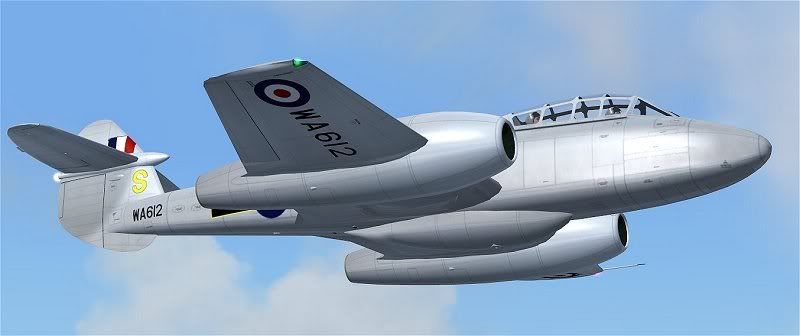
I dont think i will ever get the 'silver' as correct as Meteors are in Flightsim but i will keep at it till feel ready to do the various Squadrons for release. I might have to release her with a tainted silver scheme or as near as i can do.
I dont think i will ever get the 'silver' as correct as Meteors are in Flightsim but i will keep at it till feel ready to do the various Squadrons for release. I might have to release her with a tainted silver scheme or as near as i can do.

Re: Gloster Meteor T.7
Looking good Jason. Keep them coming