Garry
A Trident for the office!
Moderators: Guru's, The Ministry
-
Garry Russell
- The Ministry
- Posts: 27180
- Joined: 29 Jan 2005, 00:53
- Location: On the other side of the wall
Re: A Trident for the office!
:doho: Sri Dave :-( with you now 
Garry
Garry
Garry
"In the world of virtual reality things are not always what they seem."
"In the world of virtual reality things are not always what they seem."
-
DaveB
- The Ministry
- Posts: 30457
- Joined: 17 Jun 2004, 20:46
- Location: Pelsall, West Mids, UK
- Contact:
Re: A Trident for the office!
No prob amigo ;-) I've had too many of those moments myself today :roll: :brick: As I said in the first post, I quite like the 'out of service' font.. it kinda looks right unlike the 'actual' more squared font
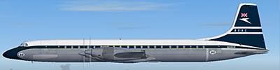
Square Trident Two (BEARS)
http://www.airliners.net/photo/BEA---Br ... 1181499/L/
Square T2 for BEAFJ - Looks ok on FJ
http://www.airliners.net/photo/BEA---Br ... 0288205/L/
Serif font for BA
http://www.airliners.net/photo/British- ... 0604186/L/
FB at Duxford is painted RS but with BA T2 titles on the nacelle which works fine for me whether it's right or not!
ATB
DaveB :tab:

Old sailors never die.. they just smell that way!
-
Garry Russell
- The Ministry
- Posts: 27180
- Joined: 29 Jan 2005, 00:53
- Location: On the other side of the wall
Re: A Trident for the office!
Originally FB was not that good when first repainted but gradually it was corrected.
Nothing major just the little details that made it not quite right
It's always a shame when a museum piece does get repainted as the paint it'self it a very large part of the visual and it seems a shame to have to cover up the real stuff....but of course it would fade away to almost nothing as with the Cambrian livery WF was in at Dux.
At least if they paint it wrong or not, it is at least protecting it and it can always be redone
Garry
Garry
"In the world of virtual reality things are not always what they seem."
"In the world of virtual reality things are not always what they seem."
Re: A Trident for the office!
Looking at the piccies that DaveB posted, "Trident two" is wrong on red square. It should be "Trident Two".
So Garry, pedants unite!
Ian
So Garry, pedants unite!
Ian
-
DaveB
- The Ministry
- Posts: 30457
- Joined: 17 Jun 2004, 20:46
- Location: Pelsall, West Mids, UK
- Contact:
Re: A Trident for the office!
It's ALL in the detail mate ;-) This all came to light on the original DM Tri2 model. I mean.. who, other than our Garry, notices things like fonts!
In his defense.. I should have said that the nacelle font was incorrect for that type of Trident (any type of Trident) 'in that livery' ;-)
ATB
DaveB :tab:
Old sailors never die.. they just smell that way!
-
Garry Russell
- The Ministry
- Posts: 27180
- Joined: 29 Jan 2005, 00:53
- Location: On the other side of the wall
Re: A Trident for the office!
Also 
The Square doesn't look square :think:
Garry
The Square doesn't look square :think:
Garry
Garry
"In the world of virtual reality things are not always what they seem."
"In the world of virtual reality things are not always what they seem."
Re: A Trident for the office!


Kind regards
John
never give up, never surrender

-
petermcleland

- Red Arrows

- Posts: 5201
- Joined: 25 Jul 2004, 10:28
- Location: Dartmouth, Devon
- Contact:
Re: A Trident for the office!
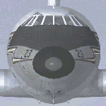
Not a Two but this Three has Sans-Serif and upper case T for Three and I'm sure the fonts were standard across the One, Two and Three fleets:-


Regards,
http://www.petermcleland.com/
Updated 28/8/2007
My Channel
http://www.youtube.com/user/petermcleland?feature=mhee
http://www.petermcleland.com/
Updated 28/8/2007
My Channel
http://www.youtube.com/user/petermcleland?feature=mhee
-
petermcleland
- Red Arrows
- Posts: 5201
- Joined: 25 Jul 2004, 10:28
- Location: Dartmouth, Devon
- Contact:
Re: A Trident for the office!
Whoops!...Just found this lower case t for three:-
So obviously it varied in a rather complex way as the liveries changed
So obviously it varied in a rather complex way as the liveries changed
Regards,
http://www.petermcleland.com/
Updated 28/8/2007
My Channel
http://www.youtube.com/user/petermcleland?feature=mhee
http://www.petermcleland.com/
Updated 28/8/2007
My Channel
http://www.youtube.com/user/petermcleland?feature=mhee
-
Garry Russell
- The Ministry
- Posts: 27180
- Joined: 29 Jan 2005, 00:53
- Location: On the other side of the wall
Re: A Trident for the office!
Hi Peter
The titles were standard font across the fleet the only variation being the 1C fleet were just 'Trident'
No sure about the two 1E's have have a pic somewhere
It was different on BA.....we are just on BEA here so youre were OK first time.
Garry
The titles were standard font across the fleet the only variation being the 1C fleet were just 'Trident'
No sure about the two 1E's have have a pic somewhere
It was different on BA.....we are just on BEA here so youre were OK first time.
Garry
Garry
"In the world of virtual reality things are not always what they seem."
"In the world of virtual reality things are not always what they seem."